jennahimel.com
jennahimel.com
PINNACLE VERIFY
PINNACLE VERIFY
PINNACLE VERIFY
A solution to reduce tedious, time consuming insurance input tasks in medical offices.
A solution to reduce tedious, time consuming insurance input tasks in medical offices.
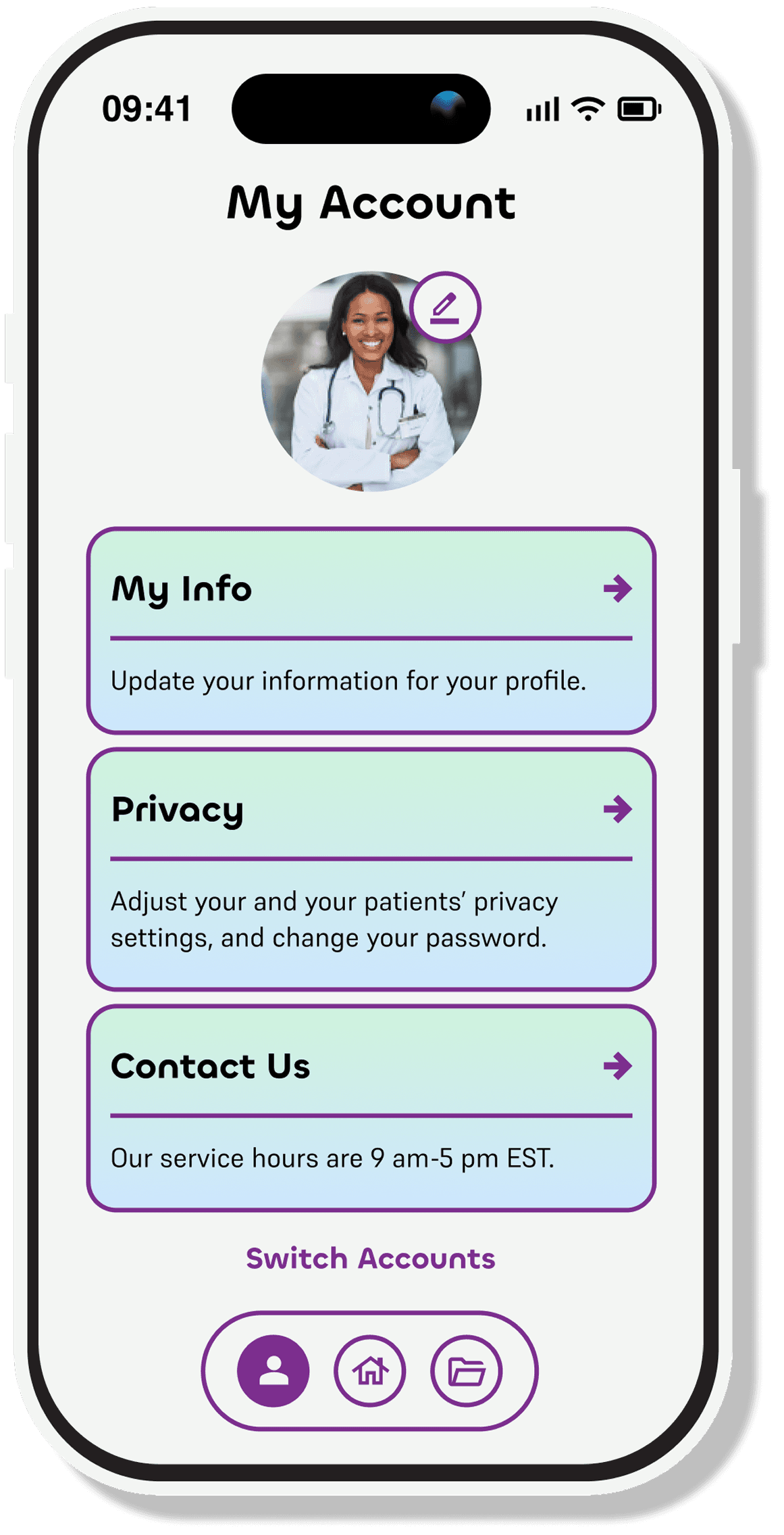
MY ROLE: UI/UX DESIGN
MY ROLE: UI/UX DESIGN
After the initial back end development had been created for the image scanning AI, I joined the project; the investors were ready to see the code turned into a usable and friendly product.
After the initial back end development had been created for the image scanning AI, I joined the project; the investors were ready to see the code turned into a usable and friendly product.
I built the UX foundation for this product, creating the architecture, prototypes, and UI from scratch.
I built the UX foundation for this product, creating the architecture, prototypes, and UI from scratch.
IN COLLABORATION WITH:
Ryan Minor (Lead Developer)
Mauro Minor (Back End Developer)
Jake Alexander (Front End Developer)
TIMELINE:
6 months
Feb 2025-October 2025
How might we design a method that can instantly capture and process insurance information?
How might we design a method that can instantly capture and process insurance information?
What do I need to consider?
What do I need to consider?

As of 2025, the average age of a physician in the US is 54, with an ever growing percentage continuing to practice medicine up until the age of 68.
As of 2025, the average age of a physician in the US is 54, with an ever growing percentage continuing to practice medicine up until the age of 68.
My UX needs to take into consideration that there will be a large number of older and less technology proficient users using this app.
My UX needs to take into consideration that there will be a large number of older and less technology proficient users using this app.
Wireframes Need To:
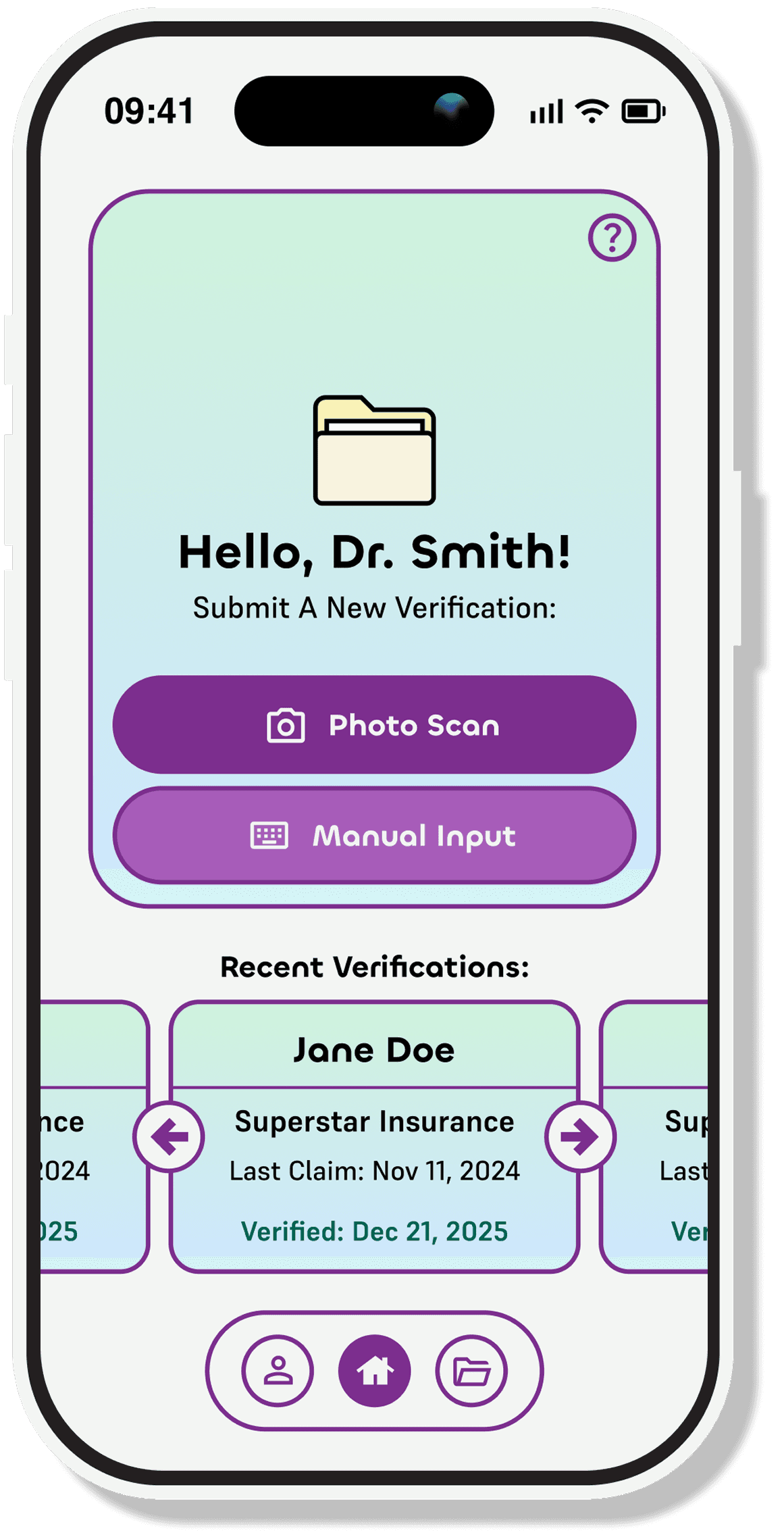
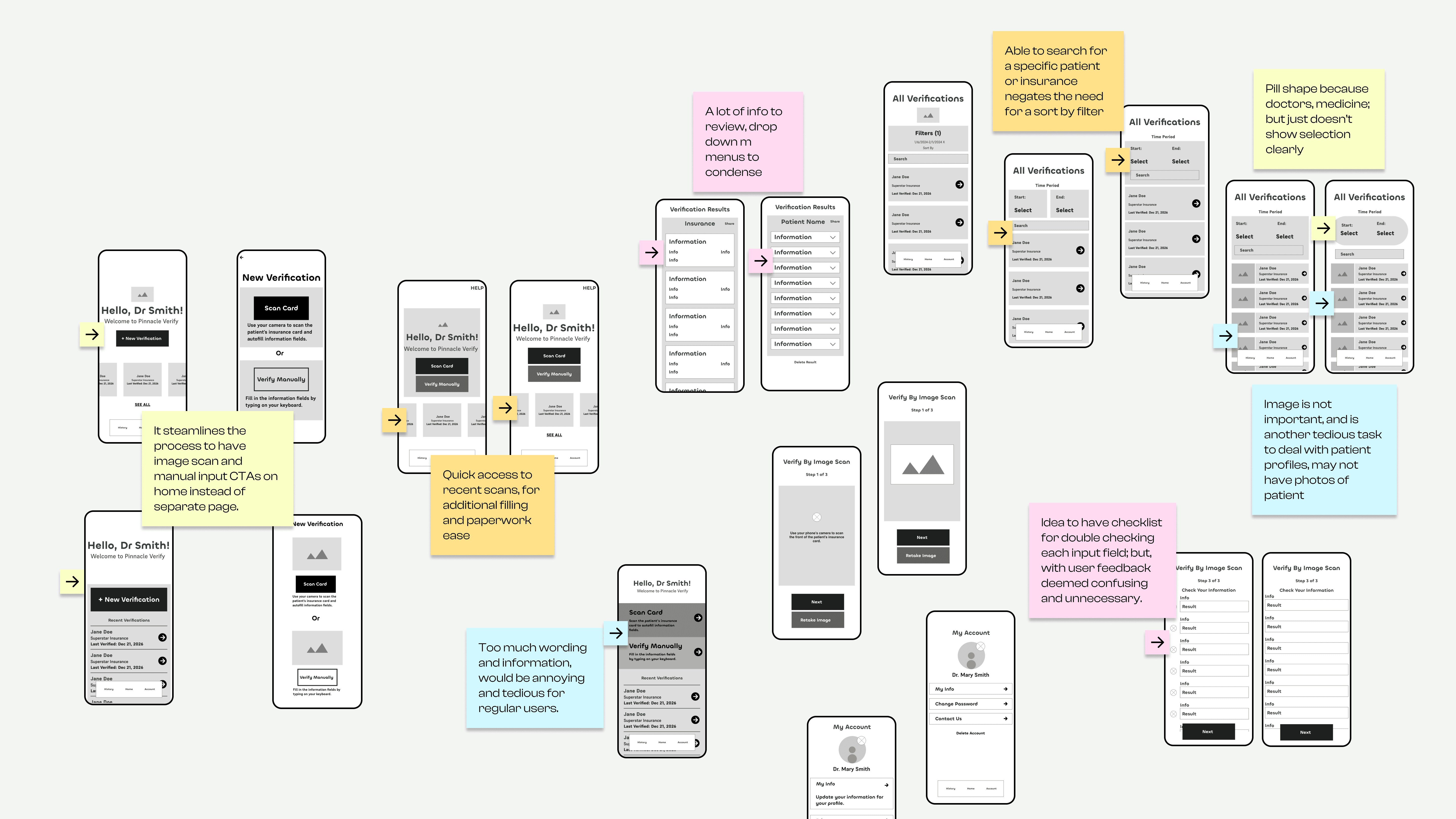
Provide quick access to star feature: image scanning
Provide quick access to star feature: image scanning
Provide quick access to star feature: image scanning
Be simple & streamlined for less technologically inclined users
Be simple & streamlined for less technologically inclined users
Be simple & streamlined for less technologically inclined users
Prioritize photo scanning over manual input
Prioritize photo scanning over manual input
Prioritize photo scanning over manual input
Visual Details to Consider:
A manilla folder on welcome screen as an homage to traditional folder systems in doctors offices.
A manilla folder on welcome screen as an homage to traditional folder systems in doctors offices.
A manilla folder on welcome screen as an homage to traditional folder systems in doctors offices.
A manilla folder on welcome screen as an homage to traditional folder systems in doctors offices.



A manilla folder on welcome screen as an homage to traditional folder systems in doctors offices.
A manilla folder on welcome screen as an homage to traditional folder systems in doctors offices.
A manilla folder on welcome screen as an homage to traditional folder systems in doctors offices.
A manilla folder on welcome screen as an homage to traditional folder systems in doctors offices.
Font is too large and throws off composition.
Font is too large and throws off composition.
Corners are too rounded, looks off.
Corners are too rounded, looks off.
Visual hierarchy
needs work.
Visual hierarchy
needs work.
Why are these iterations so visually unbalanced?
Why are these iterations so visually unbalanced?
Need to use CTA color with intent.
Need to use CTA color with intent.
Folder shaped cards are too confusing
They have character,, but don’t work.
Folder shaped cards are too confusing
They have character,, but don’t work.
Looks Cluttered.
Looks Cluttered.
My compositions were not working.
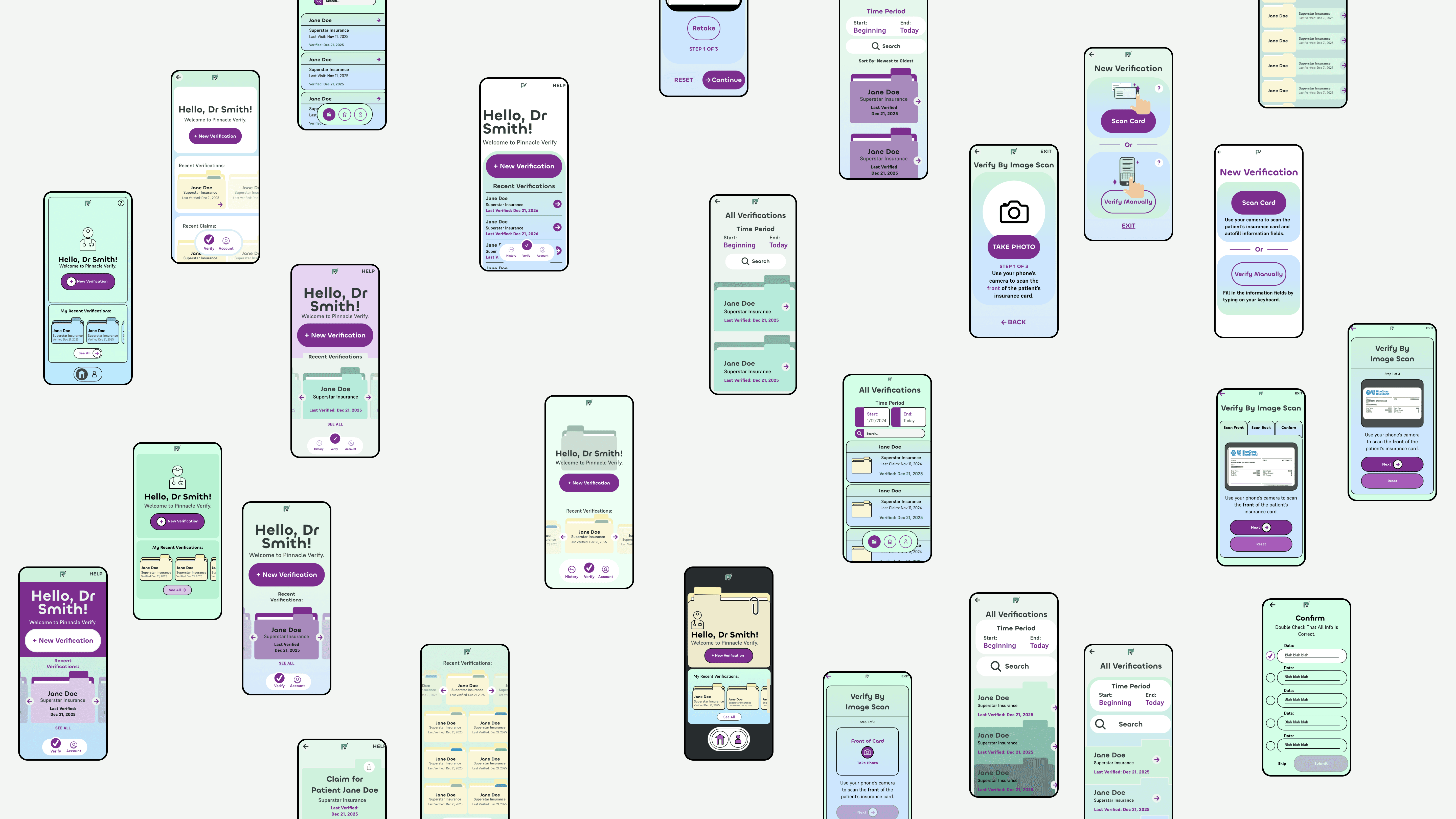
I made many variations of UI concepts and drafts. They appeared unbalanced, crammed, and too busy.
I made many variations of UI concepts and drafts. They appeared unbalanced, crammed, and too busy.
I was prioritizing illustrations and leaving no empty space , instead of hierarchy, colors with purpose, and simple shapes.
I was prioritizing illustrations and leaving no empty space , instead of hierarchy, colors with purpose, and simple shapes.
After changing my priorities, my drafts became much more intentional, easier to navigate, and overall more visually balanced.
After changing my priorities, my drafts became much more intentional, easier to navigate, and overall more visually balanced.
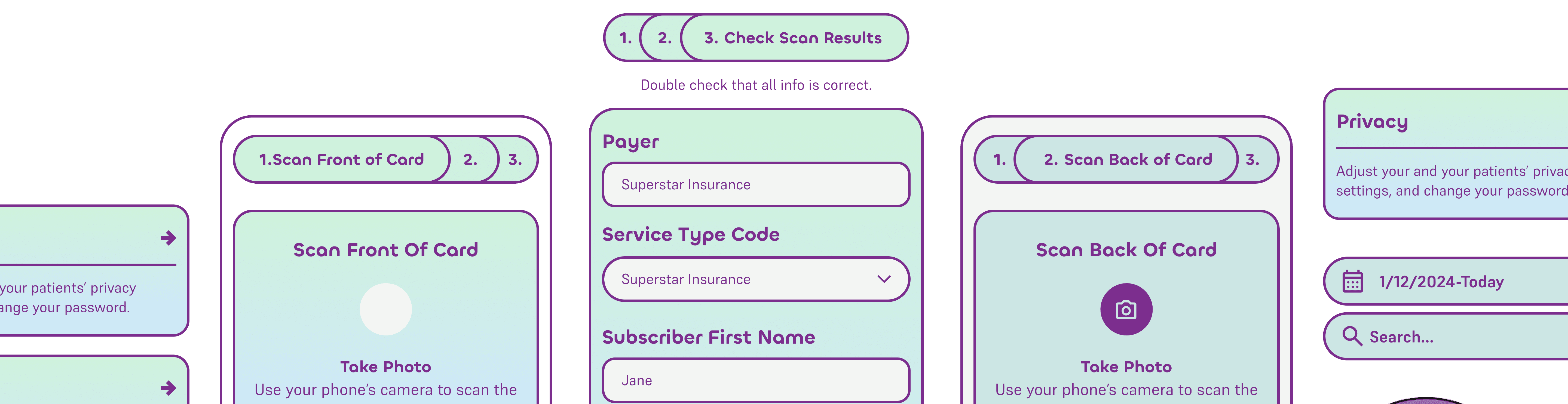

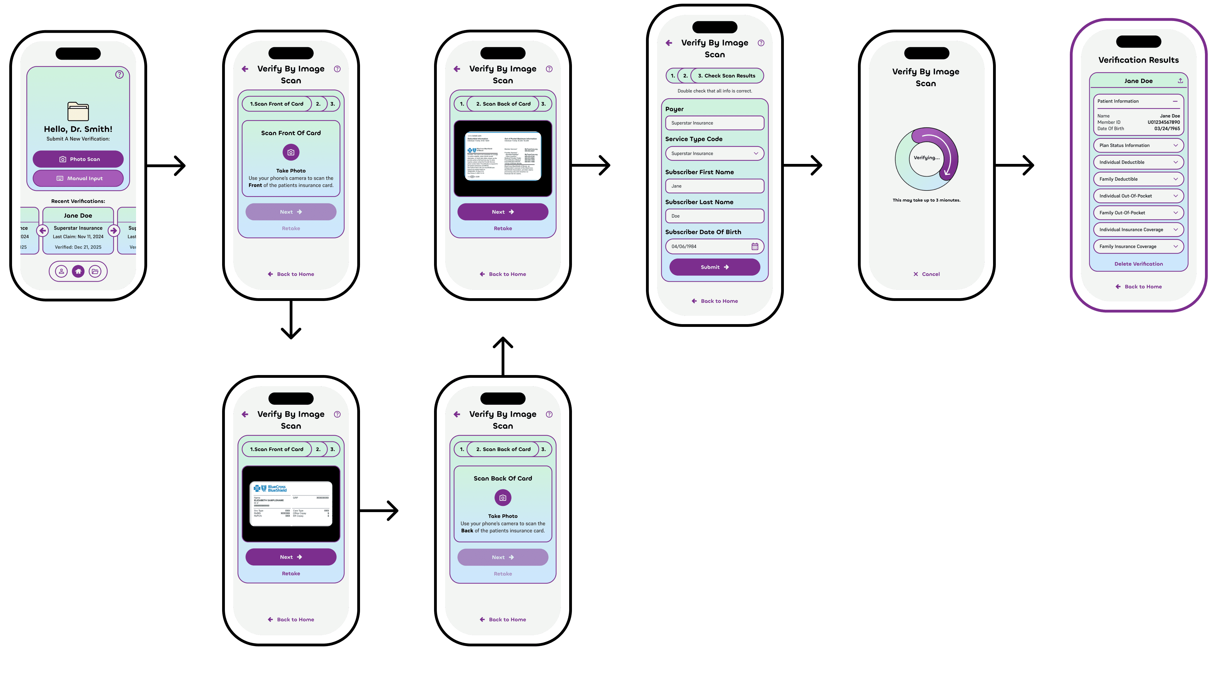
Photo Scanning
Photo Scanning
Photo Scanning
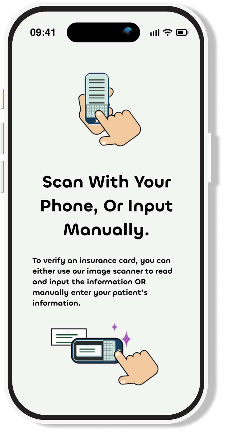
In the verification process, the user follows prompts to upload photos of the front and back of the patient’s insurance card.
In the verification process, the user follows prompts to upload photos of the front and back of the patient’s insurance card.
Each step is clearly labeled.
Each step is clearly labeled.
User’s process is saved if they accidentally exit the flow.
User’s process is saved if they accidentally exit the flow.
Results can be exported to an office management software.
Results can be exported to an office management software.
Each verification will be saved under the users’ account unless deleted.
Each verification will be saved under the users’ account unless deleted.
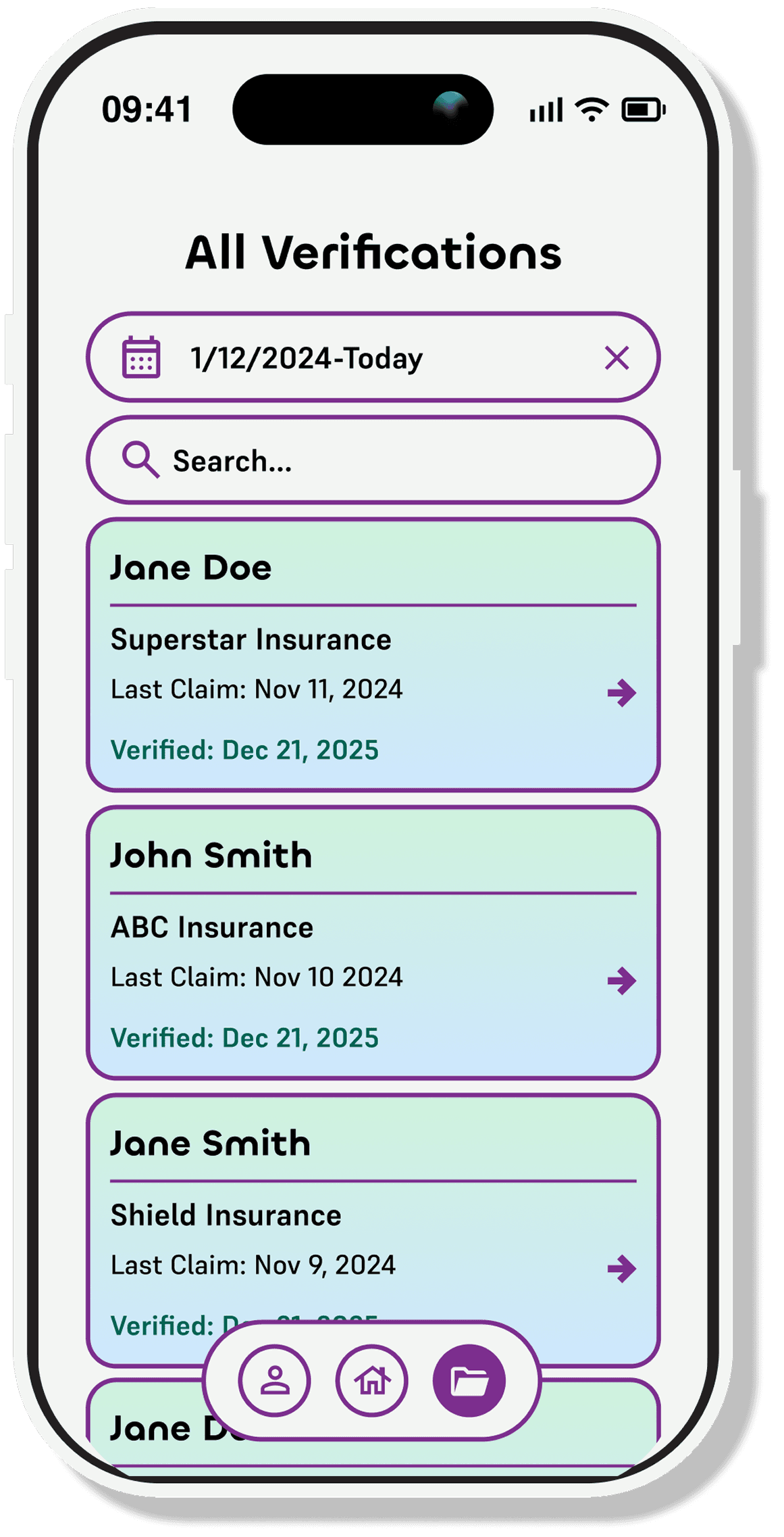
Easily find a patient and their insurance.
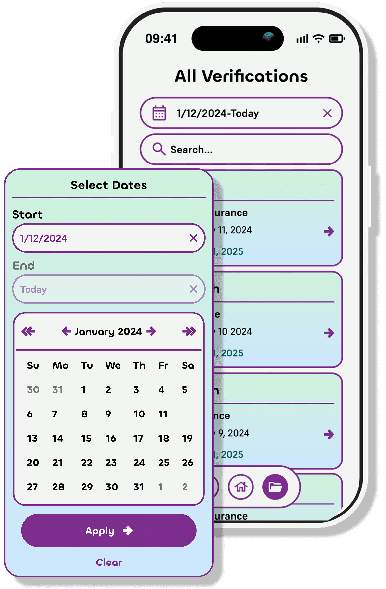
Easily find a patient and their insurance.
Easily find a patient and their insurance.
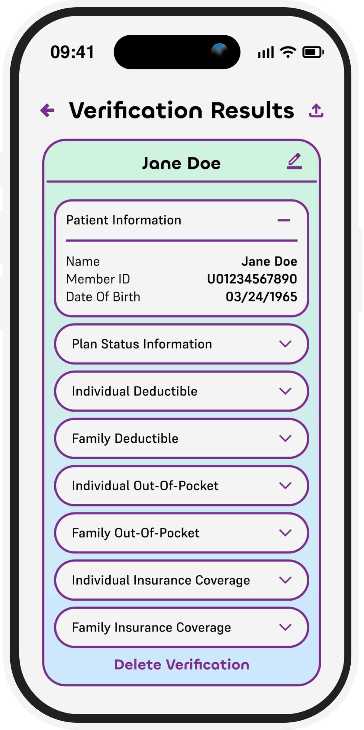
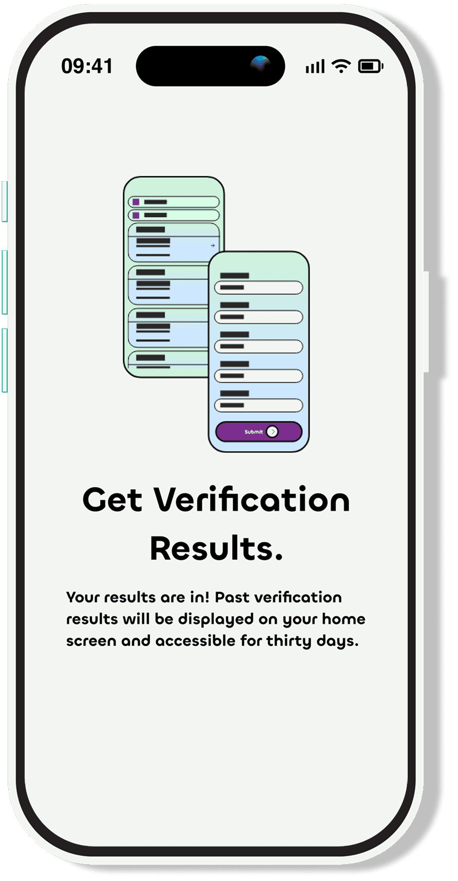
Past results can be filtered by time period, or found by search. Each verification can be updated in case of insurance change.
Past results can be filtered by time period, or found by search. Each verification can be updated in case of insurance change.
For ease of bookkeeping, the user can view results within a certain time range.
For ease of bookkeeping, the user can view results within a certain time range.
Each patient card has a highlight of their information for quick scanning.
Each patient card has a highlight of their information for quick scanning.
Insurance categories are displayed in expandable sections, to allow for visual organization.
Insurance categories are displayed in expandable sections, to allow for visual organization.

Thank You For Submitting With Pinnacle Verify.

J
e
n
n
a
H
mel
i
J
e
n
n
a
H
mel
i
J
e
n
n
a
H
mel
i